Field Value Package @cometchat/chat-uikit-reactCSS Import @import url("@cometchat/chat-uikit-react/css-variables.css");Root Wrapper .cometchat — all UI Kit components render under this classKey Tokens --cometchat-primary-color, --cometchat-background-color-03, --cometchat-font-familyDark Mode Use data-theme="dark" on wrapper or @media (prefers-color-scheme: dark) Full Token List Color Resources
Overview This guide shows you how to customize the look and feel of CometChat UI Kit components using CSS variables. You’ll learn to change colors, fonts, apply dark mode, and style specific components.
Time estimate: 15 minutes
Difficulty: IntermediatePrerequisites Use Cases Theming is essential for:
Brand consistency — Match chat UI to your app’s design systemDark mode — Support user preferences for light/dark themesComponent customization — Style specific components differentlyAccessibility — Adjust contrast and colors for better readability
Steps Step 1: Import the Base Stylesheet Add the UI Kit’s CSS variables to your global stylesheet:
@import url ( "@cometchat/chat-uikit-react/css-variables.css" );
Then import your CSS in your app entry:
Step 2: Apply Global Theme Overrides Override CSS variables on the .cometchat class to change the entire UI:
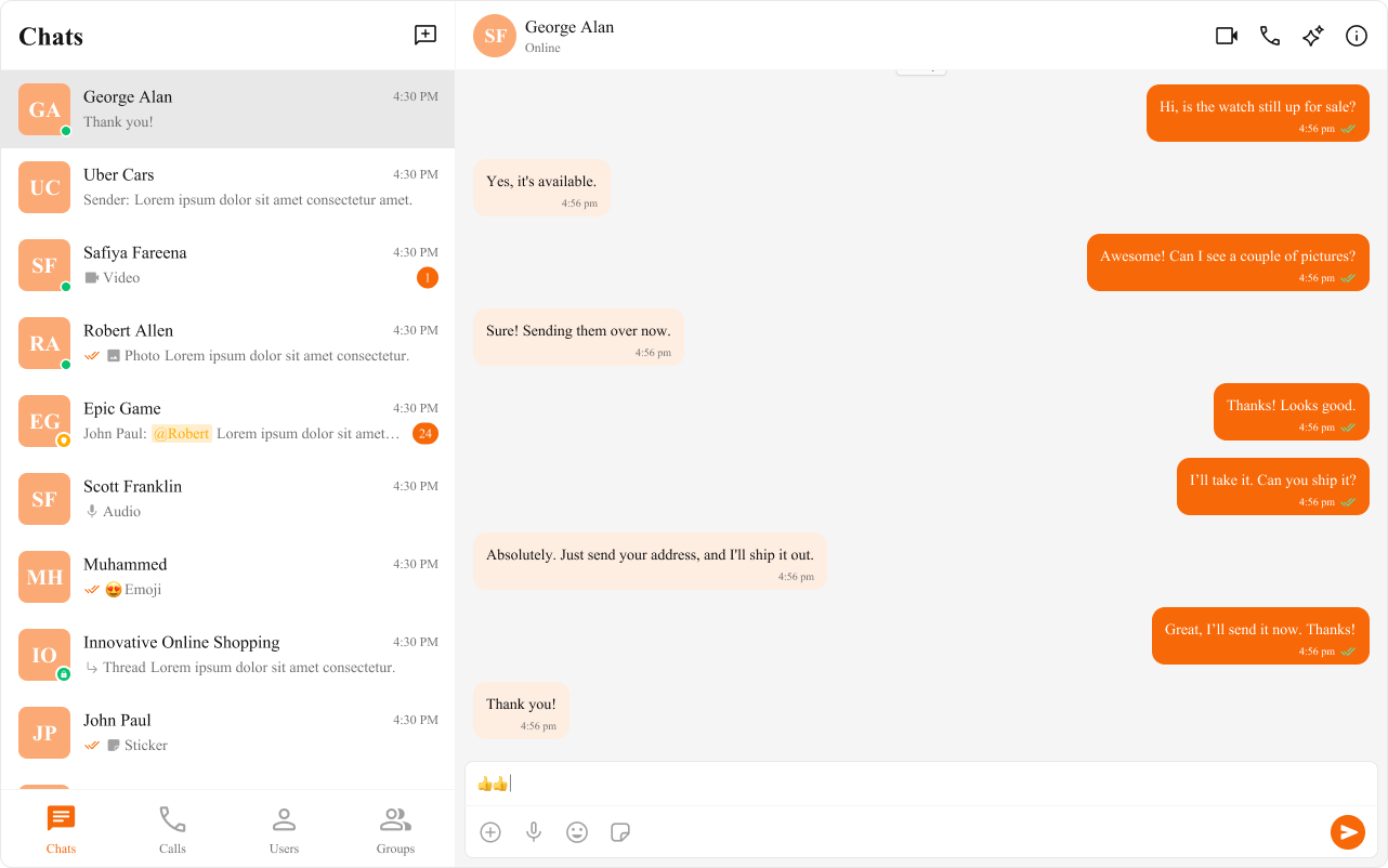
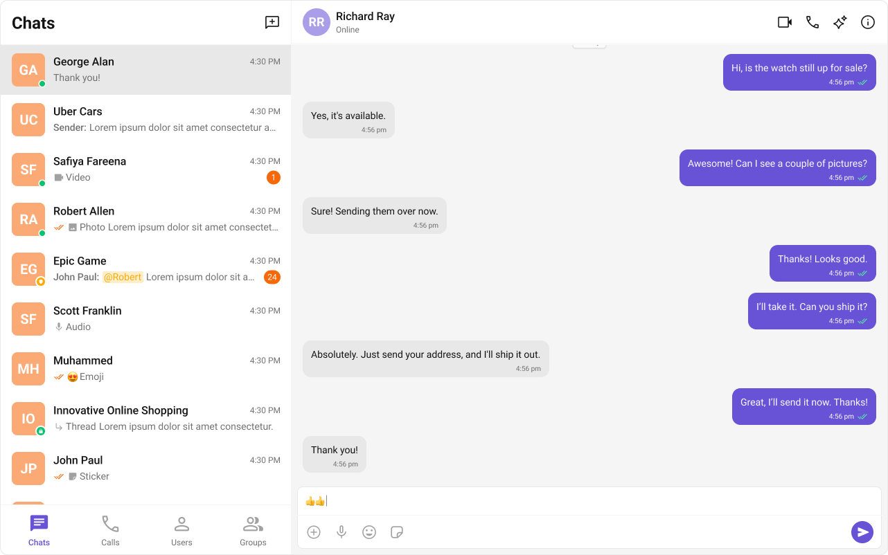
@import url ( "@cometchat/chat-uikit-react/css-variables.css" ); .cometchat { --cometchat-primary-color : #6852d6 ; --cometchat-extended-primary-color-500 : #8b7be8 ; --cometchat-background-color-03 : #f9f8fd ; --cometchat-text-color-highlight : #6852d6 ; --cometchat-icon-color-highlight : #6852d6 ; --cometchat-font-family : "Inter" , sans-serif ; }
Step 3: Understand Token Precedence CSS variable overrides follow this precedence (highest to lowest):
Element-level CSS overrides (most specific)
Component-scoped variables (.cometchat .cometchat-conversations)
Global variables (.cometchat)
Defaults from css-variables.css
Step 4: Style Specific Components Apply different styles to individual components:
/* Only style the Conversations component */ .cometchat .cometchat-conversations { --cometchat-primary-color : #f76808 ; --cometchat-message-seen-color : #f76808 ; --cometchat-radius-max : 12 px ; } /* Only style outgoing message bubbles */ .cometchat .cometchat-message-bubble-outgoing .cometchat-message-bubble__body { --cometchat-primary-color : #0f766e ; --cometchat-extended-primary-color-900 : #14b8a6 ; } /* Only style incoming message bubbles */ .cometchat .cometchat-message-bubble-incoming .cometchat-message-bubble__body { --cometchat-neutral-color-300 : #f1f5f9 ; }
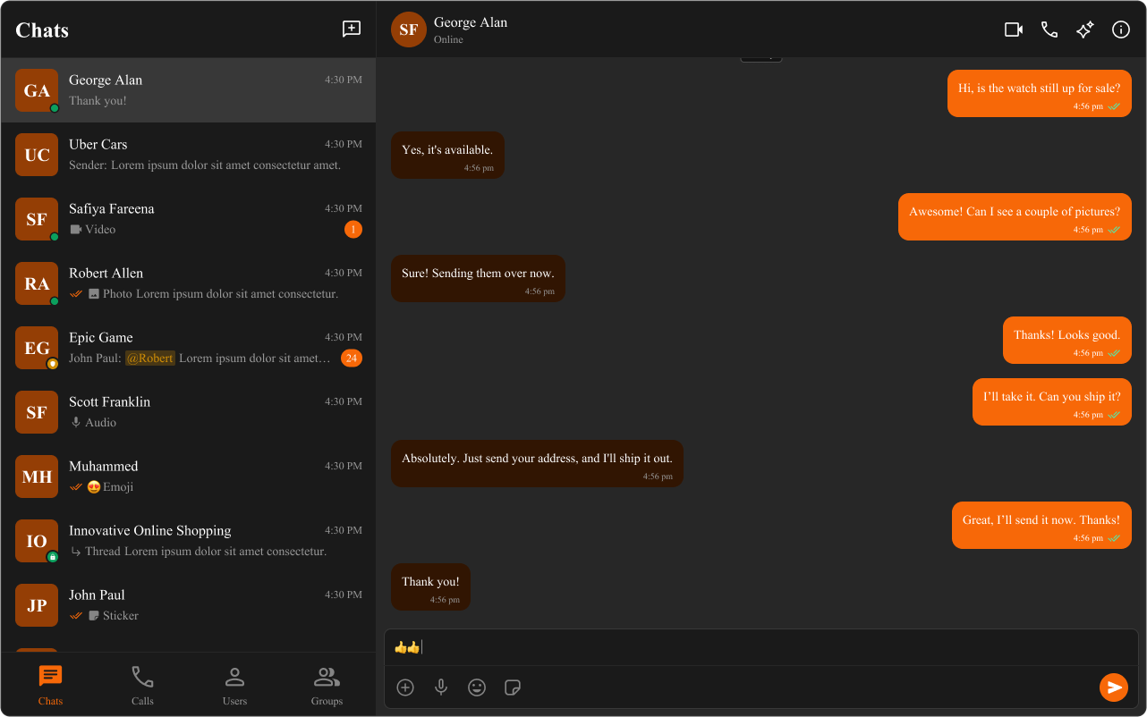
Step 5: Add Dark Mode Support Choose one of two approaches for dark mode:
Option A: App-Controlled (Recommended) import { useState , useEffect } from "react" ; import "./App.css" ; function App () { const [ theme , setTheme ] = useState ( "light" ); useEffect (() => { const mediaQuery = window . matchMedia ( "(prefers-color-scheme: dark)" ); setTheme ( mediaQuery . matches ? "dark" : "light" ); const handleChange = ( e : MediaQueryListEvent ) => { setTheme ( e . matches ? "dark" : "light" ); }; mediaQuery . addEventListener ( "change" , handleChange ); return () => mediaQuery . removeEventListener ( "change" , handleChange ); }, []); return ( < div className = "cometchat-root" data-theme = { theme } > { /* Your chat components */ } </ div > ); } export default App ;
/* Light theme (default) */ .cometchat { --cometchat-primary-color : #6852d6 ; --cometchat-background-color-03 : #ffffff ; --cometchat-neutral-color-300 : #f5f5f5 ; } /* Dark theme */ .cometchat-root [ data-theme = "dark" ] .cometchat { --cometchat-primary-color : #8b7be8 ; --cometchat-background-color-03 : #1a1a1a ; --cometchat-neutral-color-300 : #2d2d2d ; --cometchat-neutral-color-50 : #121212 ; }
Option B: OS-Controlled .cometchat { --cometchat-primary-color : #6852d6 ; --cometchat-background-color-03 : #ffffff ; } @media (prefers-color-scheme: dark) { .cometchat { --cometchat-primary-color : #8b7be8 ; --cometchat-background-color-03 : #1a1a1a ; --cometchat-neutral-color-300 : #2d2d2d ; } }
Step 6: Advanced Element Targeting For fine-grained control, target specific CSS selectors:
/* Round avatars to squares */ .cometchat-conversations .cometchat-avatar , .cometchat-conversations .cometchat-avatar__image { border-radius : 12 px ; } /* Custom call button styling */ .cometchat-call-button .cometchat-button { border-radius : 8 px ; border : 1 px solid #e8e8e8 ; background : #edeafa ; } /* Custom message input styling */ .cometchat-message-composer .cometchat-message-composer__input { border-radius : 24 px ; background : #f5f5f5 ; }
Complete Example Here’s a full theming setup with light/dark mode and brand colors:
import { useState , useEffect } from "react" ; import { CometChatConversations , CometChatMessageHeader , CometChatMessageList , CometChatMessageComposer , } from "@cometchat/chat-uikit-react" ; import { CometChat } from "@cometchat/chat-sdk-javascript" ; import "./App.css" ; function App () { const [ theme , setTheme ] = useState ( "light" ); const [ selectedConversation , setSelectedConversation ] = useState < CometChat . Conversation >(); useEffect (() => { const mediaQuery = window . matchMedia ( "(prefers-color-scheme: dark)" ); setTheme ( mediaQuery . matches ? "dark" : "light" ); const handleChange = ( e : MediaQueryListEvent ) => { setTheme ( e . matches ? "dark" : "light" ); }; mediaQuery . addEventListener ( "change" , handleChange ); return () => mediaQuery . removeEventListener ( "change" , handleChange ); }, []); const toggleTheme = () => { setTheme (( prev ) => ( prev === "light" ? "dark" : "light" )); }; const getConversationWith = () => { if ( ! selectedConversation ) return null ; const type = selectedConversation . getConversationType (); if ( type === "user" ) { return { user: selectedConversation . getConversationWith () as CometChat . User }; } return { group: selectedConversation . getConversationWith () as CometChat . Group }; }; const conversationWith = getConversationWith (); return ( < div className = "cometchat-root" data-theme = { theme } > < button onClick = { toggleTheme } className = "theme-toggle" > { theme === "light" ? "🌙" : "☀️" } </ button > < div style = { { display: "flex" , height: "100vh" , width: "100vw" } } > < div style = { { width: 400 , borderRight: "1px solid var(--cometchat-neutral-color-300)" } } > < CometChatConversations onItemClick = { ( conversation ) => setSelectedConversation ( conversation ) } /> </ div > { conversationWith ? ( < div style = { { flex: 1 , display: "flex" , flexDirection: "column" } } > < CometChatMessageHeader { ... conversationWith } /> < CometChatMessageList { ... conversationWith } /> < CometChatMessageComposer { ... conversationWith } /> </ div > ) : ( < div style = { { flex: 1 , display: "grid" , placeItems: "center" } } > Select a conversation </ div > ) } </ div > </ div > ); } export default App ;
@import url ( "@cometchat/chat-uikit-react/css-variables.css" ); /* Light theme */ .cometchat { --cometchat-primary-color : #6852d6 ; --cometchat-extended-primary-color-500 : #8b7be8 ; --cometchat-extended-primary-color-900 : #4a3a9e ; --cometchat-background-color-03 : #ffffff ; --cometchat-neutral-color-300 : #f5f5f5 ; --cometchat-text-color-highlight : #6852d6 ; --cometchat-icon-color-highlight : #6852d6 ; --cometchat-font-family : "Inter" , -apple-system , BlinkMacSystemFont, sans-serif ; } /* Dark theme */ .cometchat-root [ data-theme = "dark" ] .cometchat { --cometchat-primary-color : #8b7be8 ; --cometchat-extended-primary-color-500 : #a99ef0 ; --cometchat-extended-primary-color-900 : #6852d6 ; --cometchat-background-color-03 : #1a1a1a ; --cometchat-neutral-color-300 : #2d2d2d ; --cometchat-neutral-color-50 : #121212 ; --cometchat-text-color-highlight : #a99ef0 ; --cometchat-icon-color-highlight : #a99ef0 ; } /* Theme toggle button */ .theme-toggle { position : fixed ; top : 16 px ; right : 16 px ; z-index : 1000 ; padding : 8 px 16 px ; border-radius : 8 px ; border : none ; cursor : pointer ; font-size : 20 px ; }
Token Usage --cometchat-primary-colorPrimary accent (buttons, outgoing bubbles, active states) --cometchat-extended-primary-color-900Darker primary shade --cometchat-extended-primary-color-500Mid primary shade (hover states) --cometchat-neutral-color-300Neutral surfaces (incoming bubbles, panels) --cometchat-background-color-03Panel backgrounds --cometchat-text-color-highlightHighlighted text color --cometchat-icon-color-highlightHighlighted icon color --cometchat-message-seen-colorRead receipt indicator --cometchat-font-familyGlobal font family --cometchat-radius-maxMaximum border radius
For the complete list, see Color Resources .
For dynamic theme changes without page reload: import { useEffect } from "react" ; function useRuntimeTheme ( primaryColor : string ) { useEffect (() => { document . documentElement . style . setProperty ( "--cometchat-primary-color" , primaryColor ); }, [ primaryColor ]); }
Common Issues Use global CSS files, not CSS Modules. Hashed class names from CSS Modules won’t match UI Kit selectors.
Issue Solution Styles not applying Ensure CSS import is in global stylesheet, not a CSS Module Dark mode not working Check data-theme attribute is on the wrapper element Component styles overridden Use more specific selectors (.cometchat .cometchat-component) Fonts not loading Ensure font is imported/loaded before setting --cometchat-font-family Variables not recognized Verify @import url("@cometchat/chat-uikit-react/css-variables.css"); is first
For more help, see the Troubleshooting Guide or contact CometChat Support .
Next Steps 